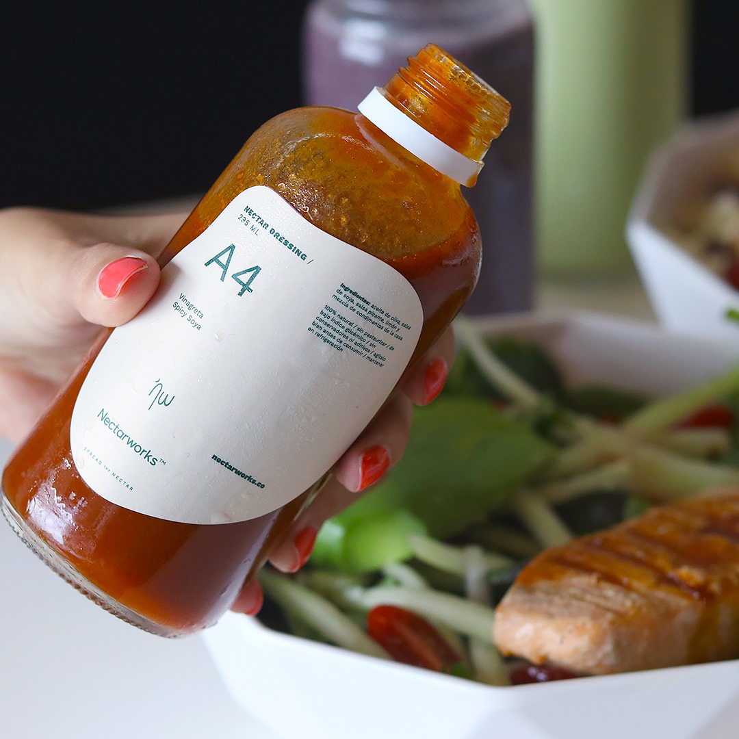
Nectarworks has become the most important Healthy foods chain in the north of the country, they describe themselves as a brand that is in constant movement, always fresh and current. We build an identity that is perceived as neutral in its graphic system, but very flexible when it comes to representing different moods and brand messages through, especially packaging and interior design.Nutrition has never been so delicious.
Nectarworks
2020
Identity / Interior
Brand
Services
︎

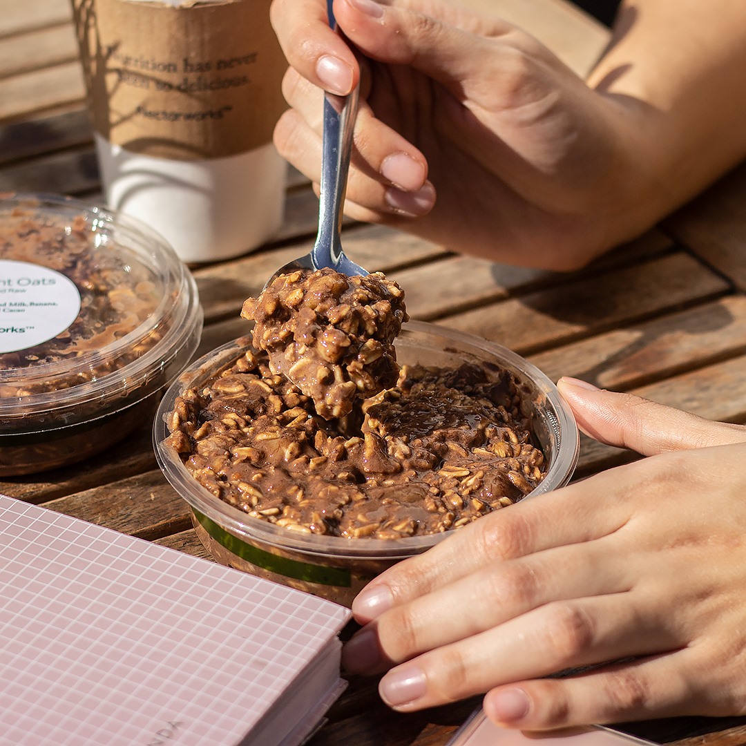
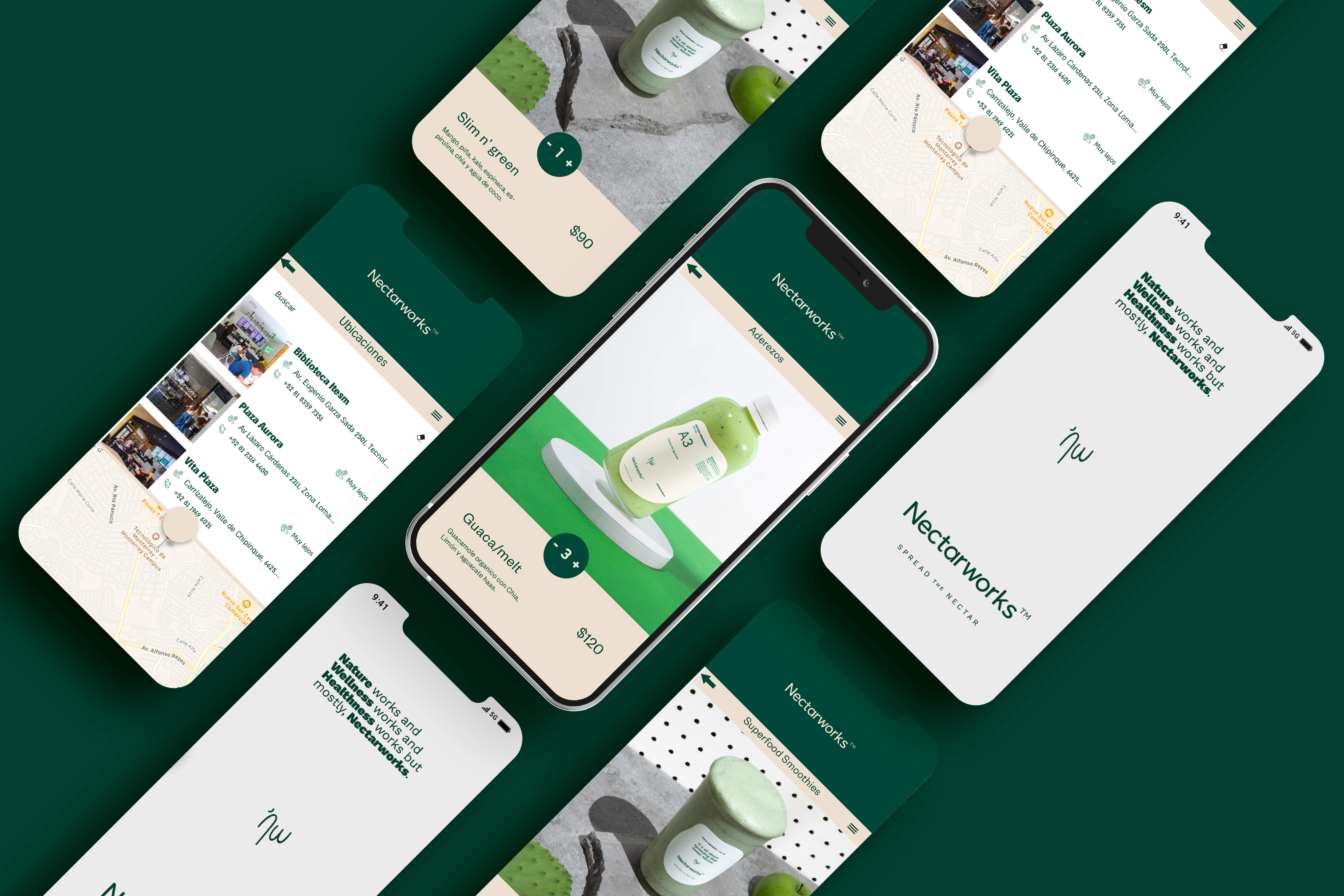
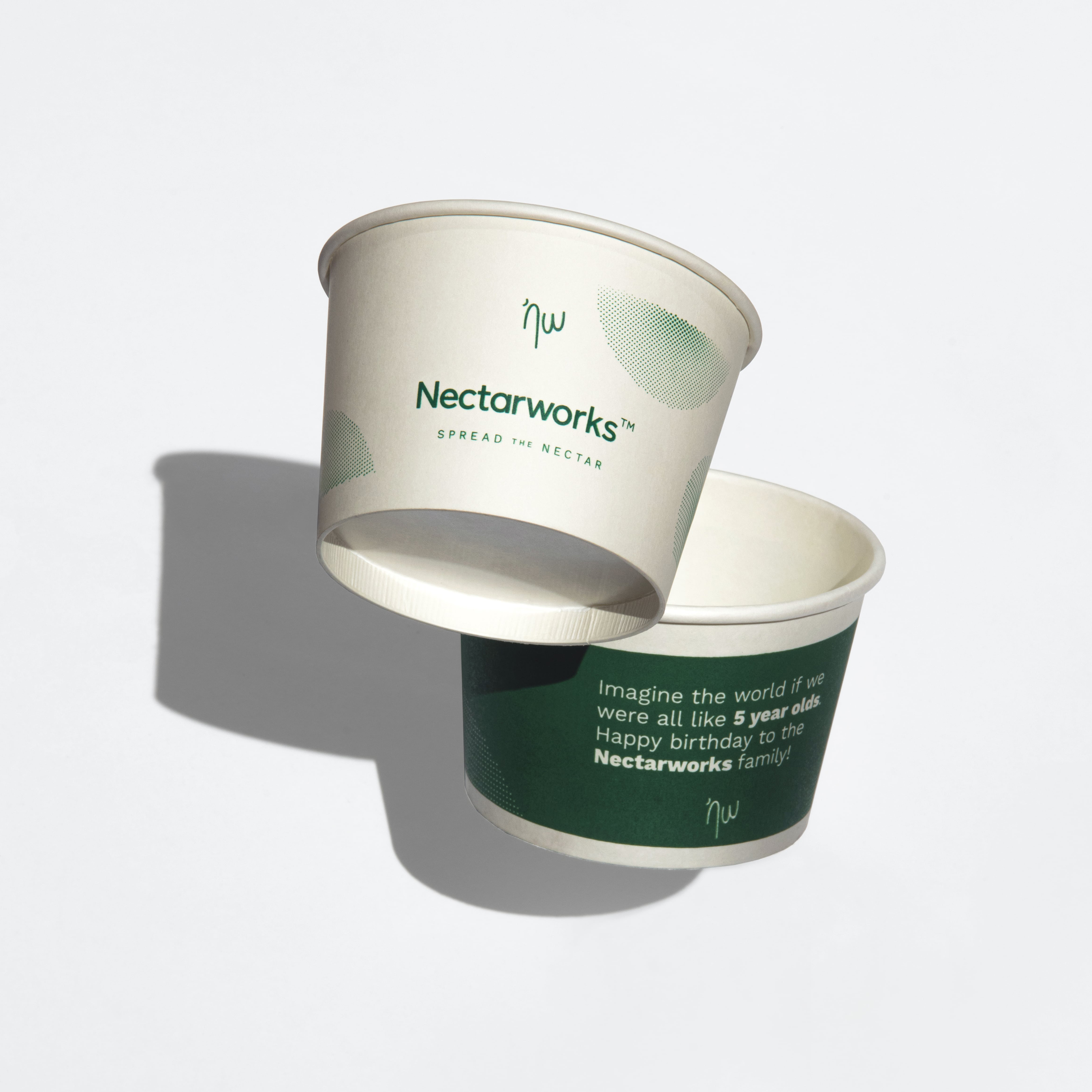
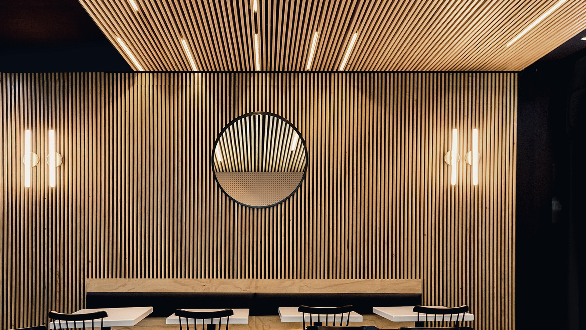
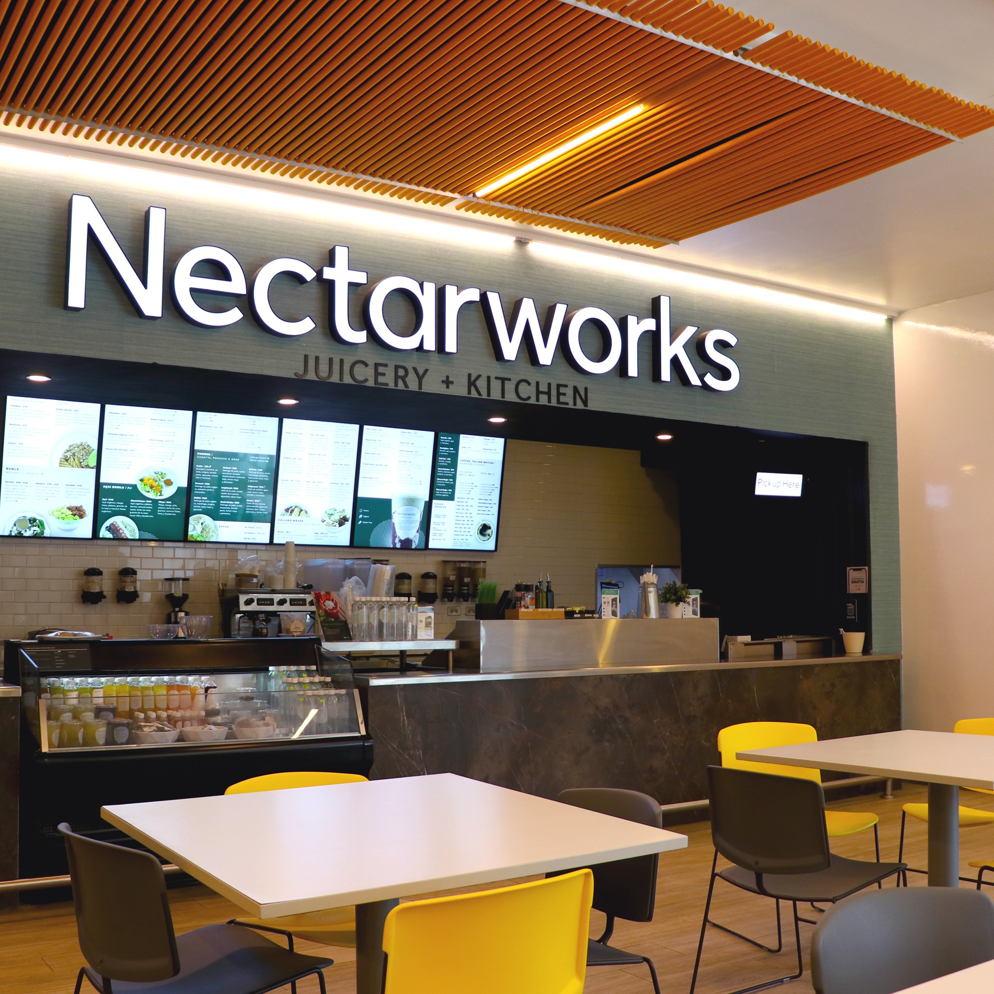
Each Nectarworks space looks different, but key elements are perceived such as the use of wood and natural stones as base materials, the white and green tones convey freshness and youth.

Bottle label design
Nectarworks is an honest and direct brand, it knows how to speak to people from the north of the country who are frank and direct, without losing the positive mood.

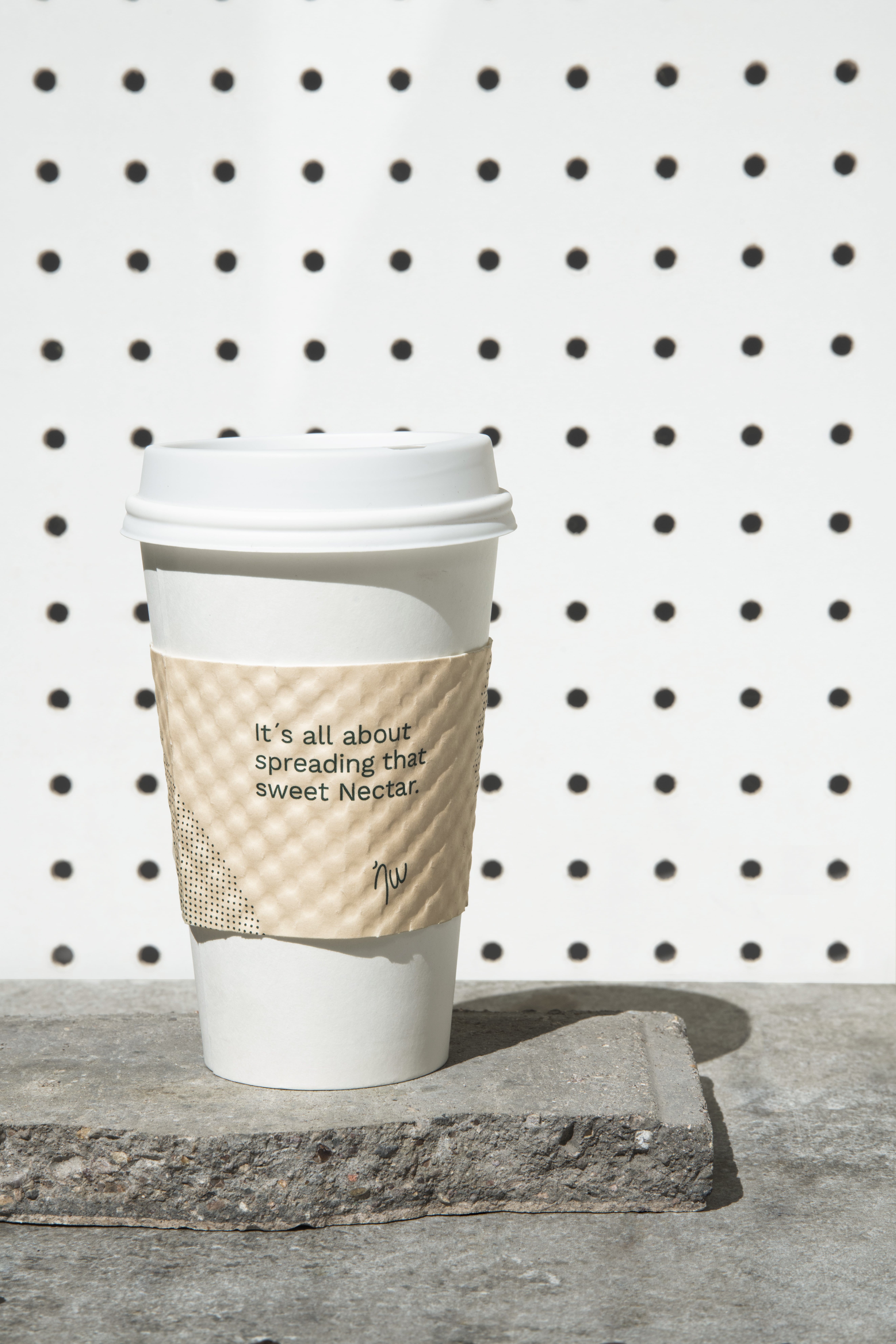
Take away cup
“The tree says: my strength is trust. I don't know anything about my parents and I don't know anything about the thousands of children born to me every year. I live, until the end, the secret of my seed and I take care of nothing else. I trust that God is in me. I trust that my mission is sacred. And of this trust I live. ”
- Herman Hesse
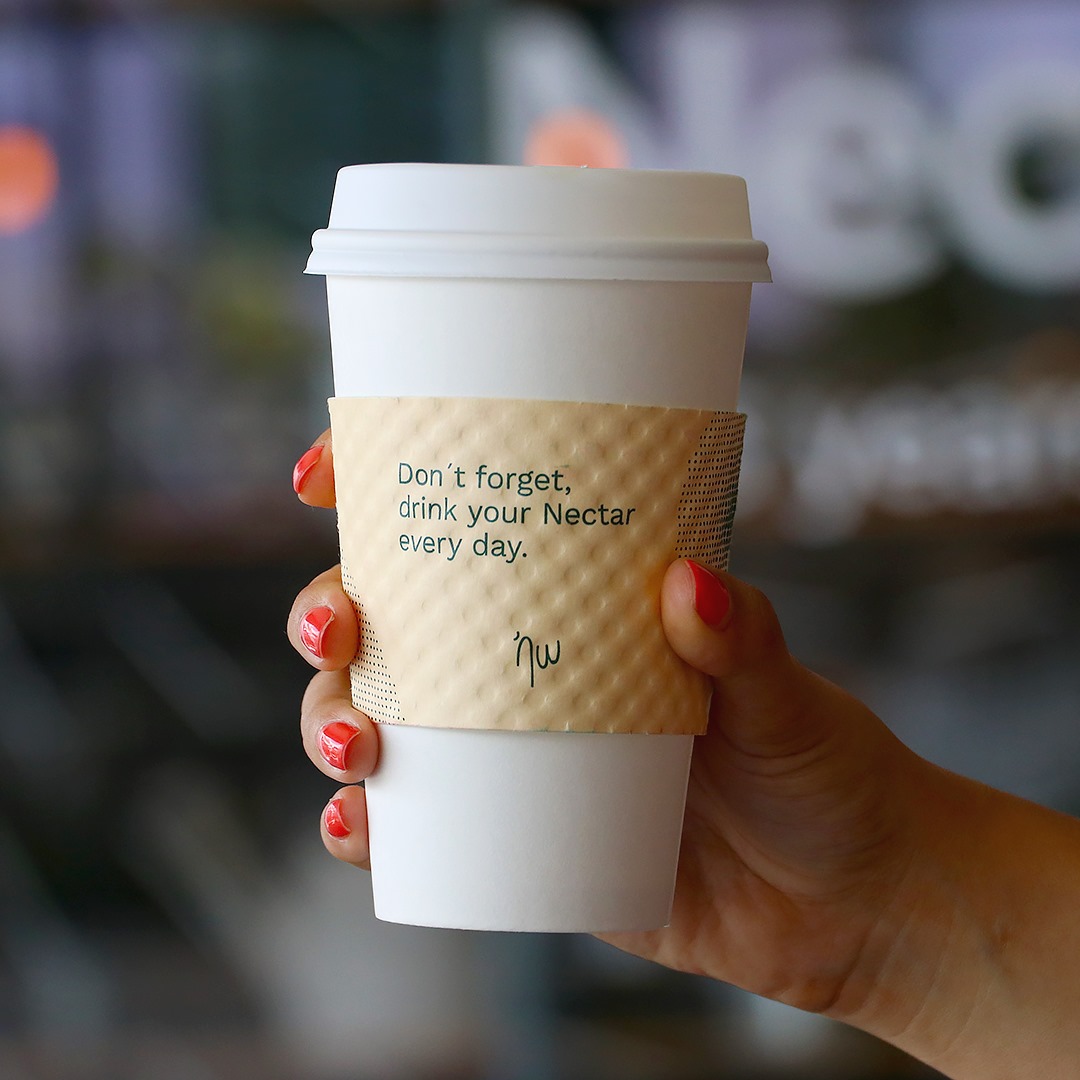
Take away cup
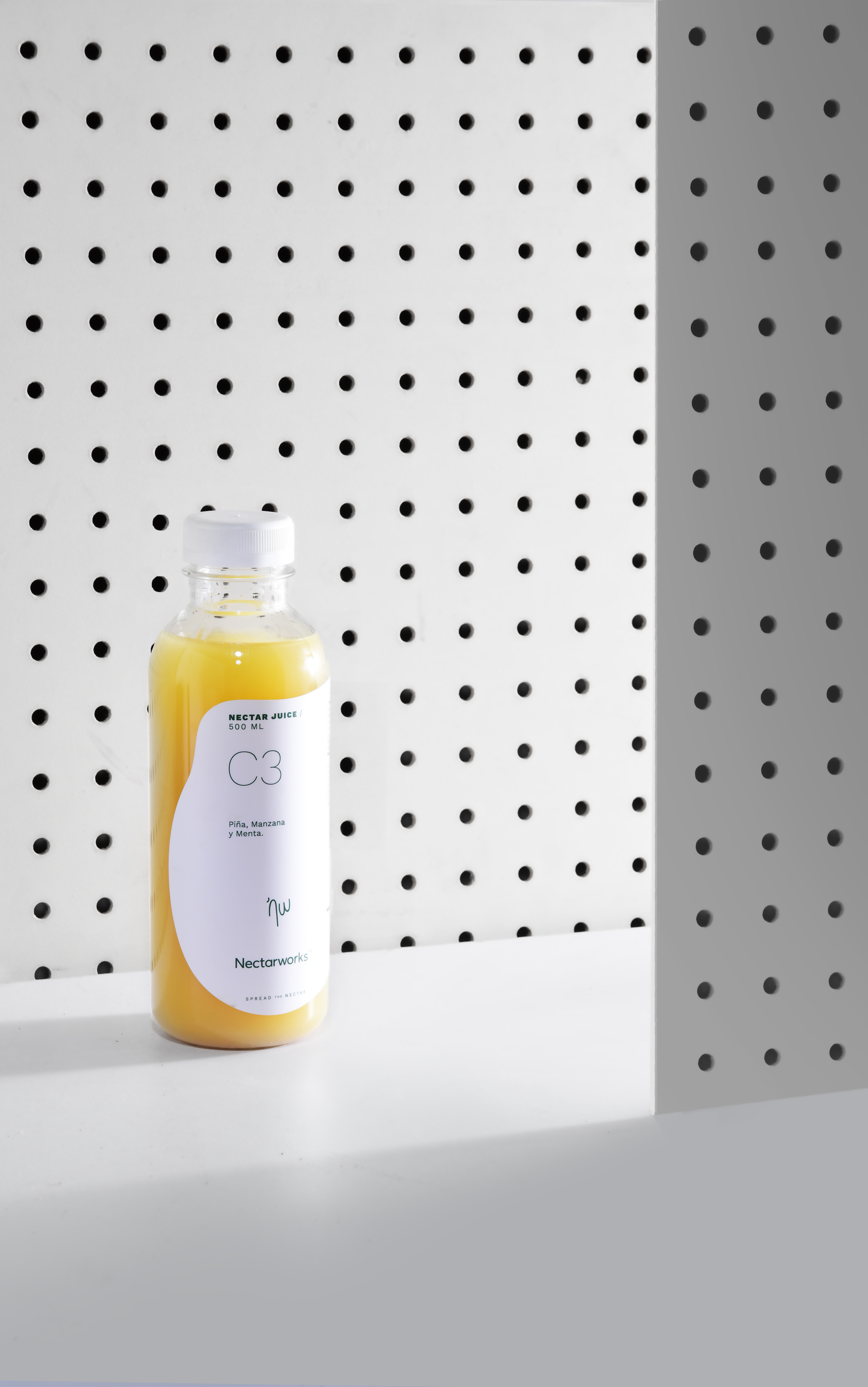
Juice packaging
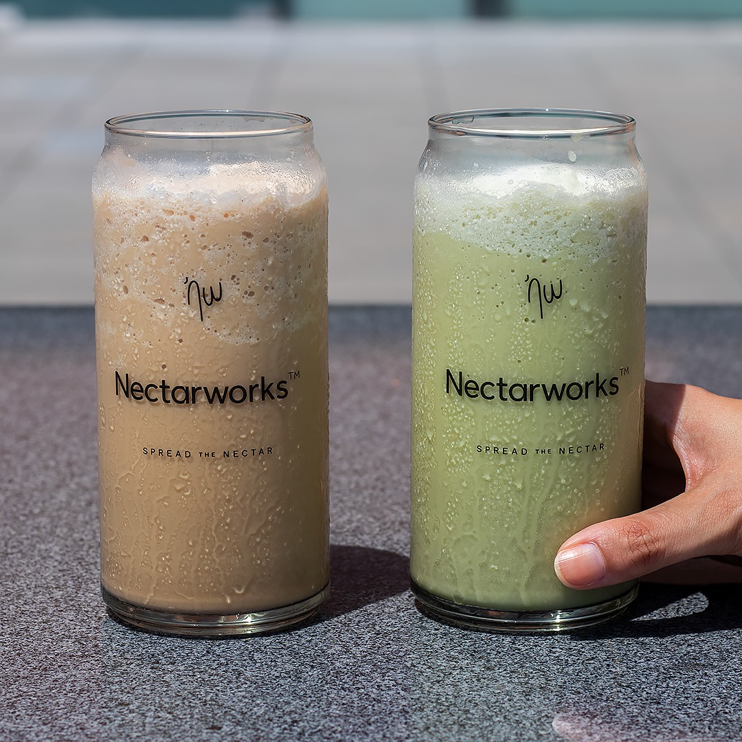
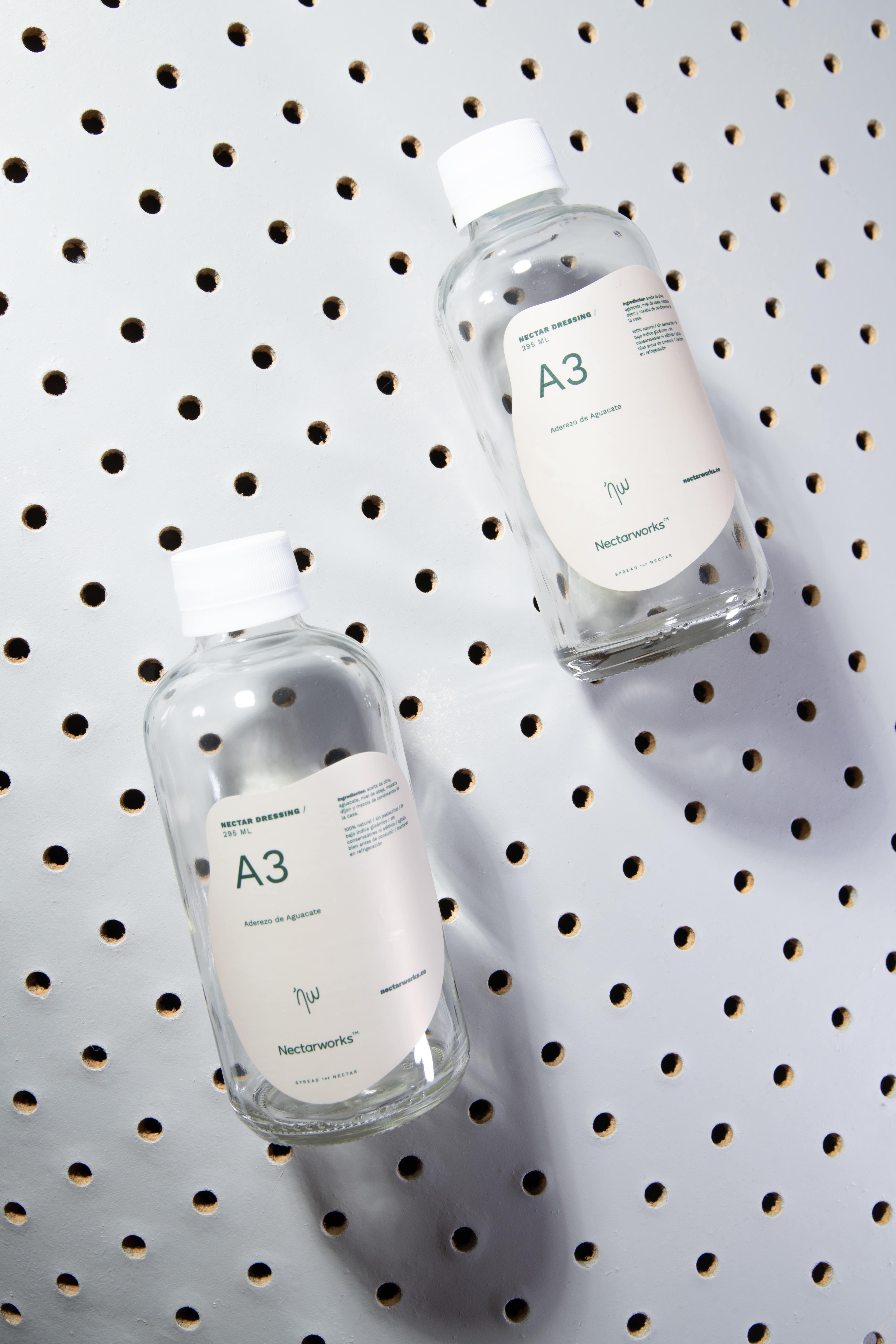
Multipurpose labels
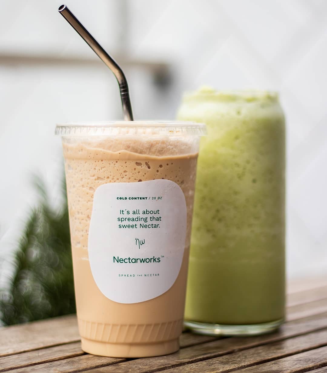
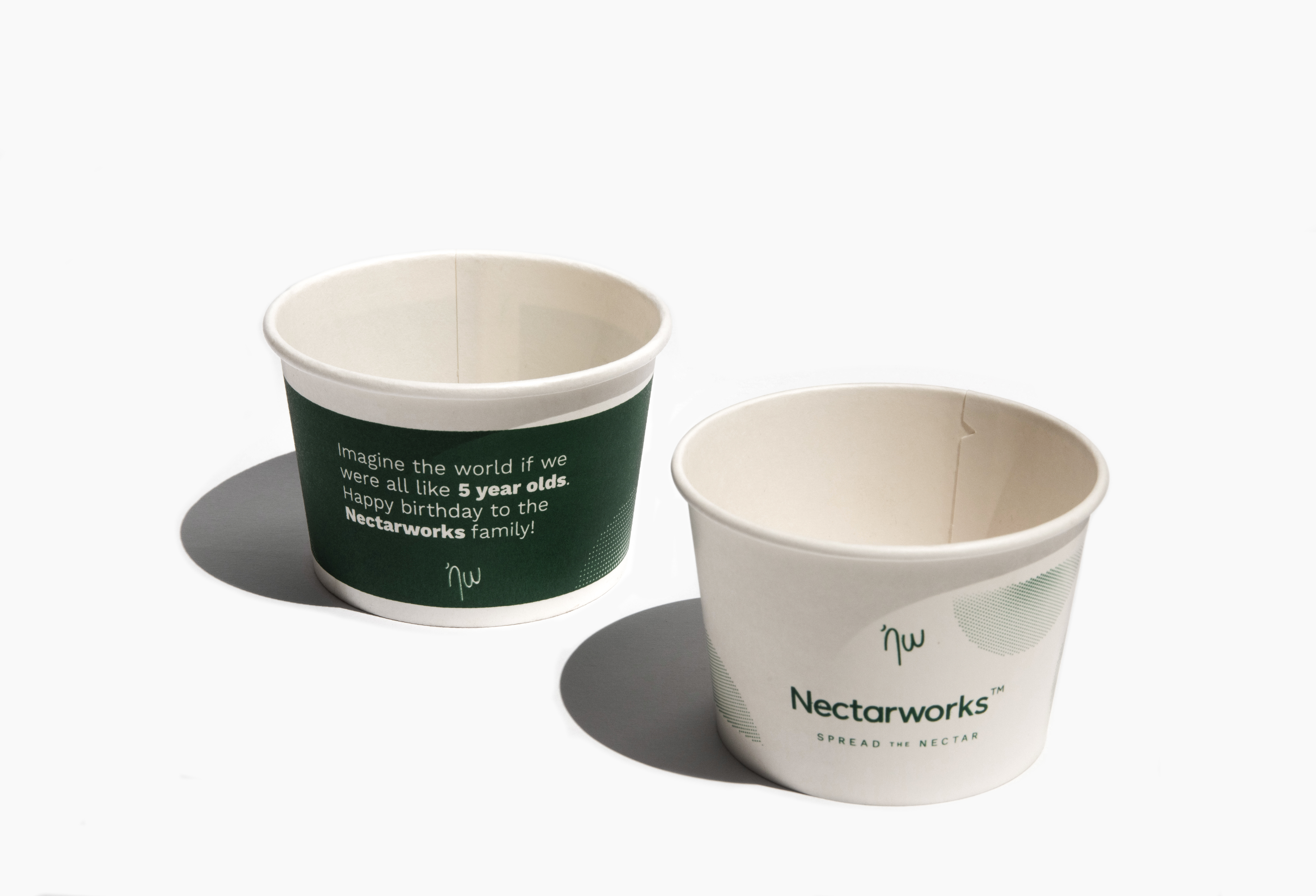
All puropose cups.
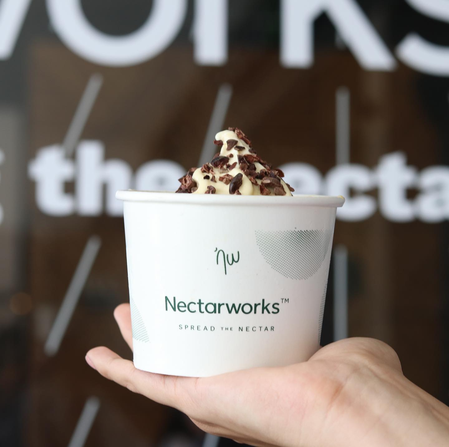
Ice cream cups
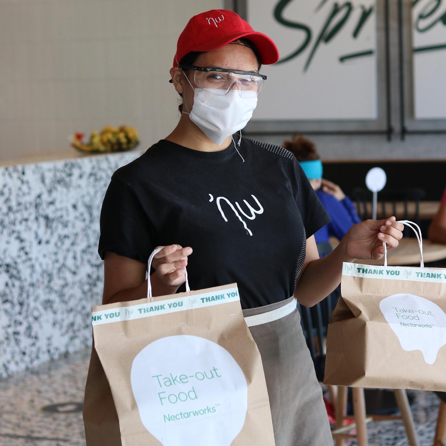
Take away bags
In site signage

